Presentation
Video
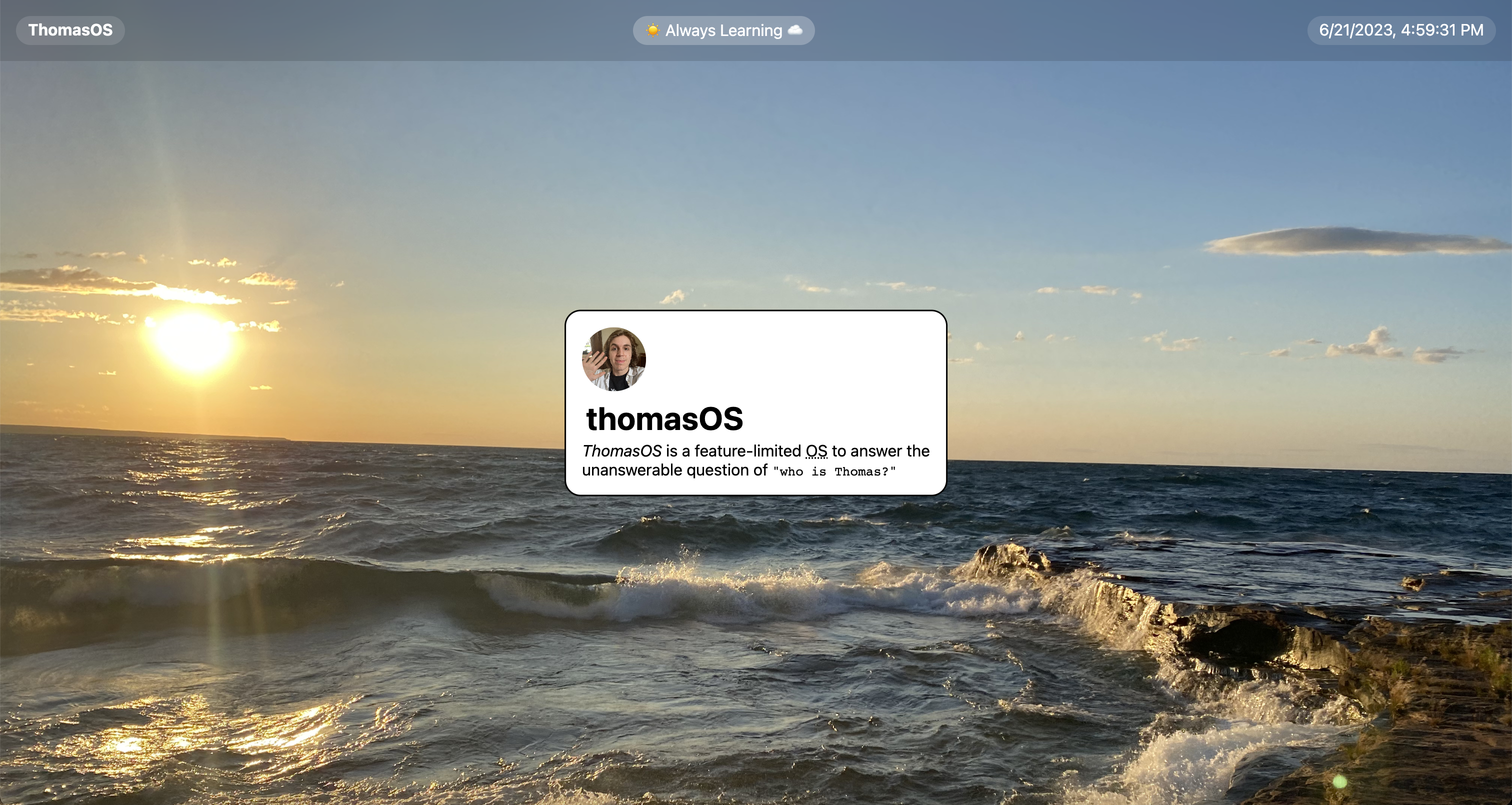
Create Your OS Desktop & Top Bar (w/ a Clock)
 SerenityUX
Mmm... Hacker, you are more brave than I thought. You're continuing on to the second Jam in the Batch. I commend your efforts.
Today we're going to be diving into JavaScript and combining it with the HTML & CSS we learned about last time. Don't worry, you'll probably survive. We'll dive into the JavaScript at the end of this Jam.
You'll be adding your outlining your window, creating your desktop, and adding a top bar.
While we will be writing JavaScript, all code will still be remain in the HTML file (until next time on WebOS Jams)
Outline:
- Defining Our “Window”
- Making Our Desktop (+ finding the coolest desktop images)
- Topping off with a Top Bar (+ letting time tell)
Defining the "Window"
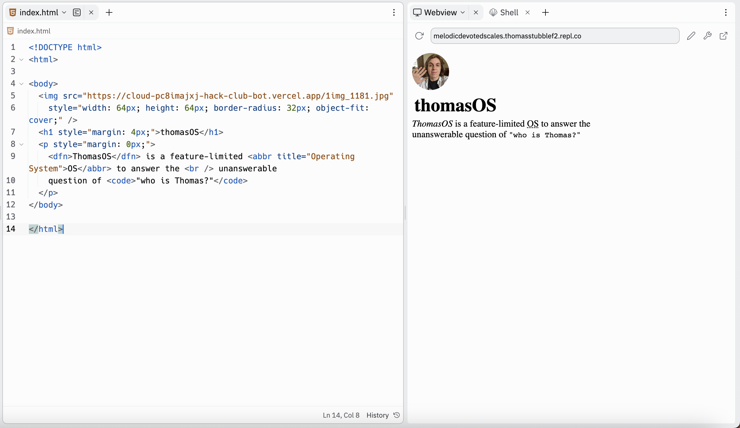
Alrighty, so you ended off last time with the start of your welcome screen. Hopefully it looks nothing like mine. As a reminder, here's what mine looked like:
What is a window?
A window is a box that defines where an application on your user interface (UI) starts and ends. I suppose a div could be any shape (if you want your windows to be circles, go for it!).
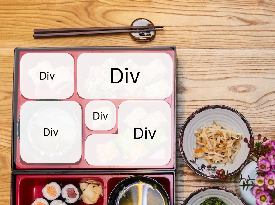
As web developers we refer to groupings/boxes as divs. You can create divs inside of divs if, for example, you had a bento box, that box itself is a group and then each little section within that group is a group.
The walls inside the box define where the content (tasty food) starts & ends & the walls along the edge of the box define where the box begins & ends.
Why do we need a window?
Having multiple windows will allow you to make users feel in control of their experience (by choosing which windows to open and focus on and which to ignore) and provide a novel/fun experience.
We need to create a div to group together the content of your window to define where your window begins and where it ends.
Creating our Window
Let's group all of our content within a div tag.
That should look something like...
Cool... well you're site hopefully looks the same & you may be thinking you did something wrong.
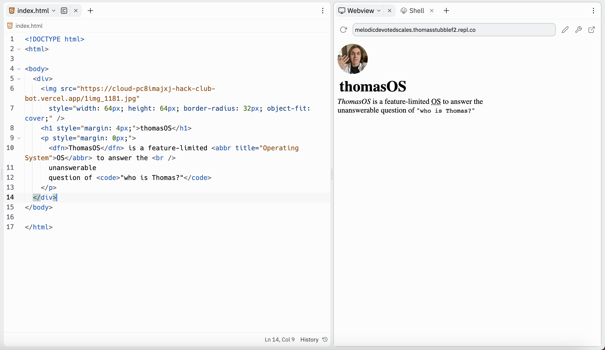
Fear not, you're on the right path. The group has no style attributes that would make it visually distinct from the rest of the page yet.
Outlining our Window
Alrighty, let's apply a style on our div (yeah... you can apply styles to divs)
Simple! Now we can see that we outlined our content.
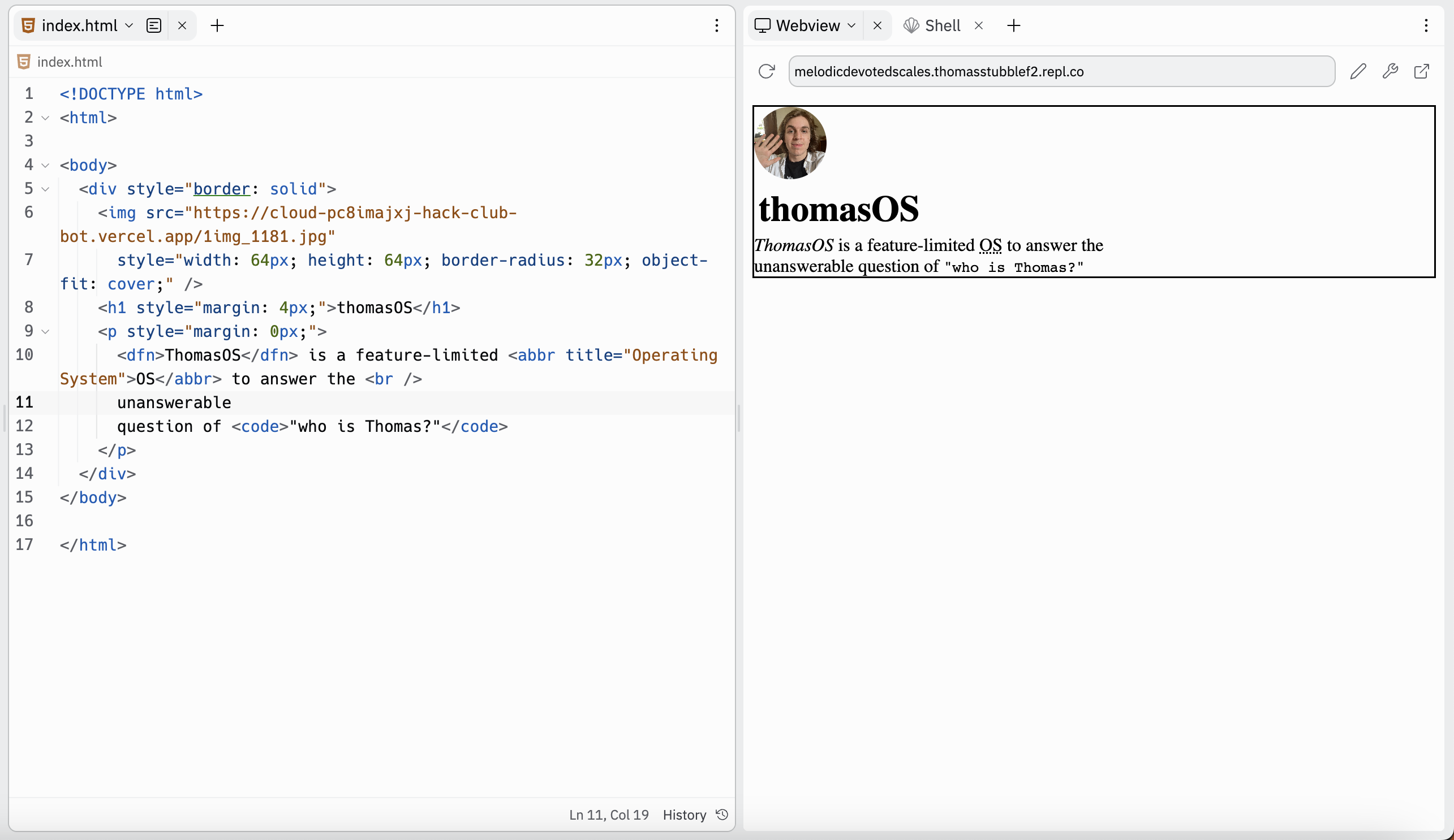
Hey... wanna have some fun? Visit this site of border styles and try adding some cool border effects (+ also your own width and color)
Finding our Boundary
We can set a width and height on our box (div) using the style property.
At the moment our box is taking up the width of the entire site!
Let's change it to a fixed width.
I chose 128 pixels, but you choose whatever size you'd like. If you'd like to be REALLY NIFTY you can also do <div style="width: fit-content">
which will make the div fit the width of your content.
Also remember how last time how we rounded the corners of our image using border-radius? Try doing rounding the corners of your div
<div style="border: solid; width: 128px; border-radius: 16px">
I chose 16px, but you can also make it much rounder by increasing that number! Experiment with it!
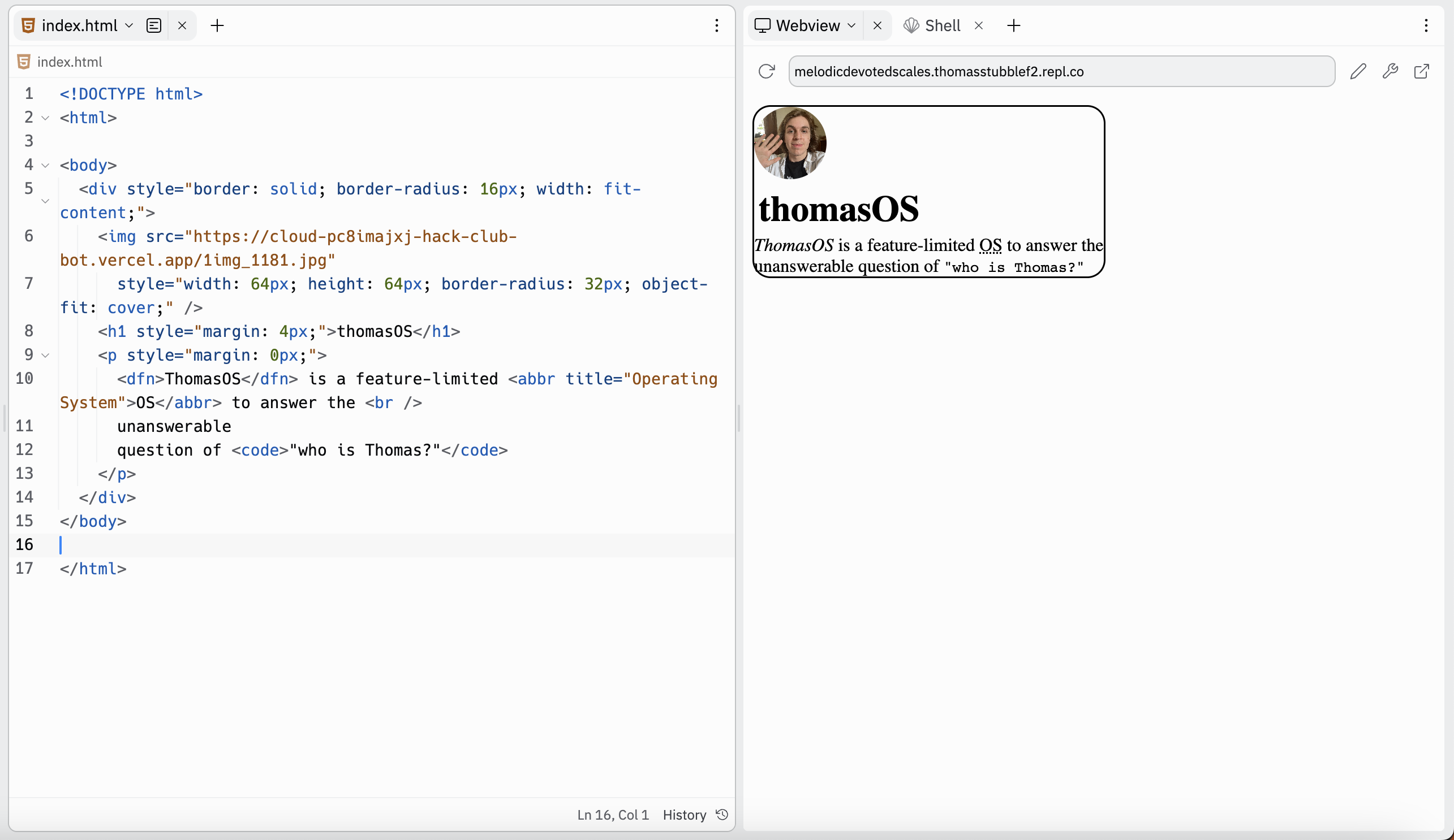
AHH THE TEXT IS A VERY CLAUSTROPHOBIC. YOU PUT IT IN A BOX AND IT HAS NOOOO BREATHING ROOM!
ADD PADDING FASTTTT
ah... that feels much better...
(p.s. don't do 16px padding, do what feels right to you)
Placing our Window
We have a screen and we have an element (our window). We want to place our element on top of our window and specify where we want it to be on the screen.
Because our window is going to exist on top of our desktop we need to use position absolute (which means that the position will not be relative to other items, but rather relative to the screen).
You don't totally need to understand position absolute right now. As we go deeper into the batch, it will start to make more sense.
Awesome and with the position: absolute property, we unlock four more properties (top, bottom, left, right). Each one defines the distance that our window will be from the edges of the screen.
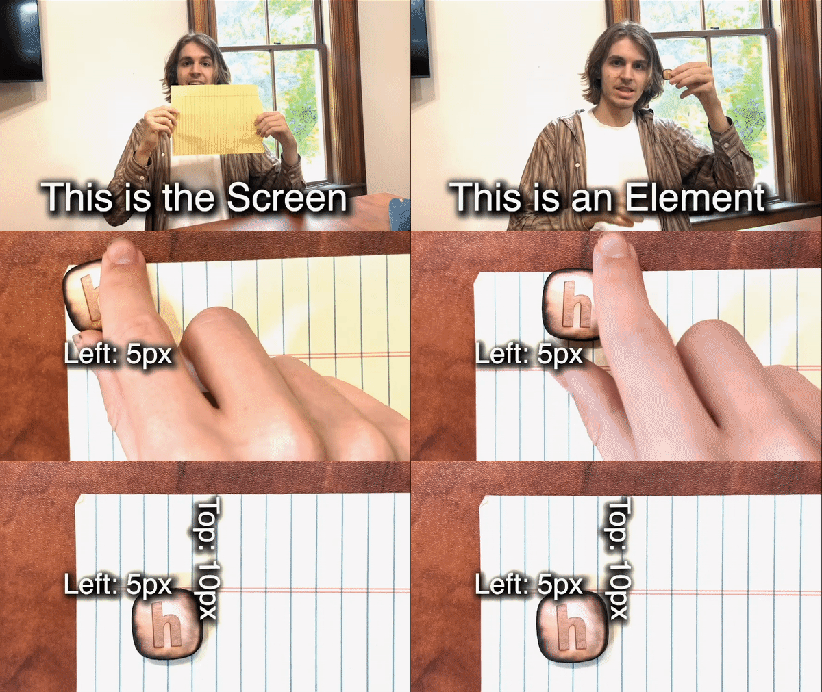
To place it in the center, we can simply write
Hmm.. well that doesn't look quite right. The reason why is because the top, left, bottom, and right properties define how far the top left corner of our window is from the walls of our browser. To fix this, let's adjust the window so that the center of the window is the point that we're positioning around by using the transform: translate(-50%, -50%) property.
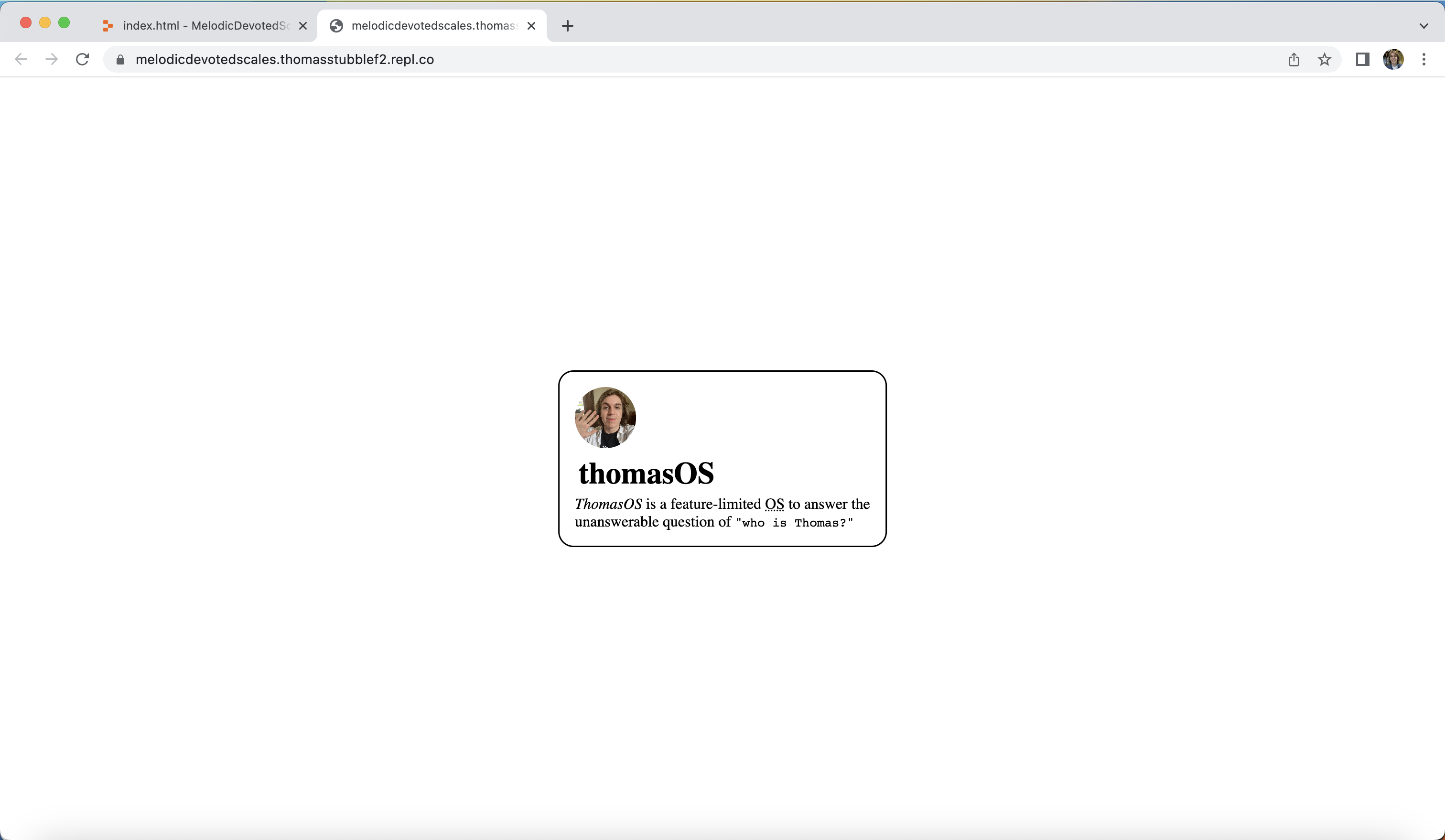
Alrighty great this is looking lovely.
This may be a good time to take a stretch break. You've been doing a lot of coding & your site is looking beautiful!
Designing Our Desktop
You're back. You're refreshed. Maybe you even ate a strawberry or two ~~(or maybe a whole package of strawberries)~~.
Adding The Desktop Background
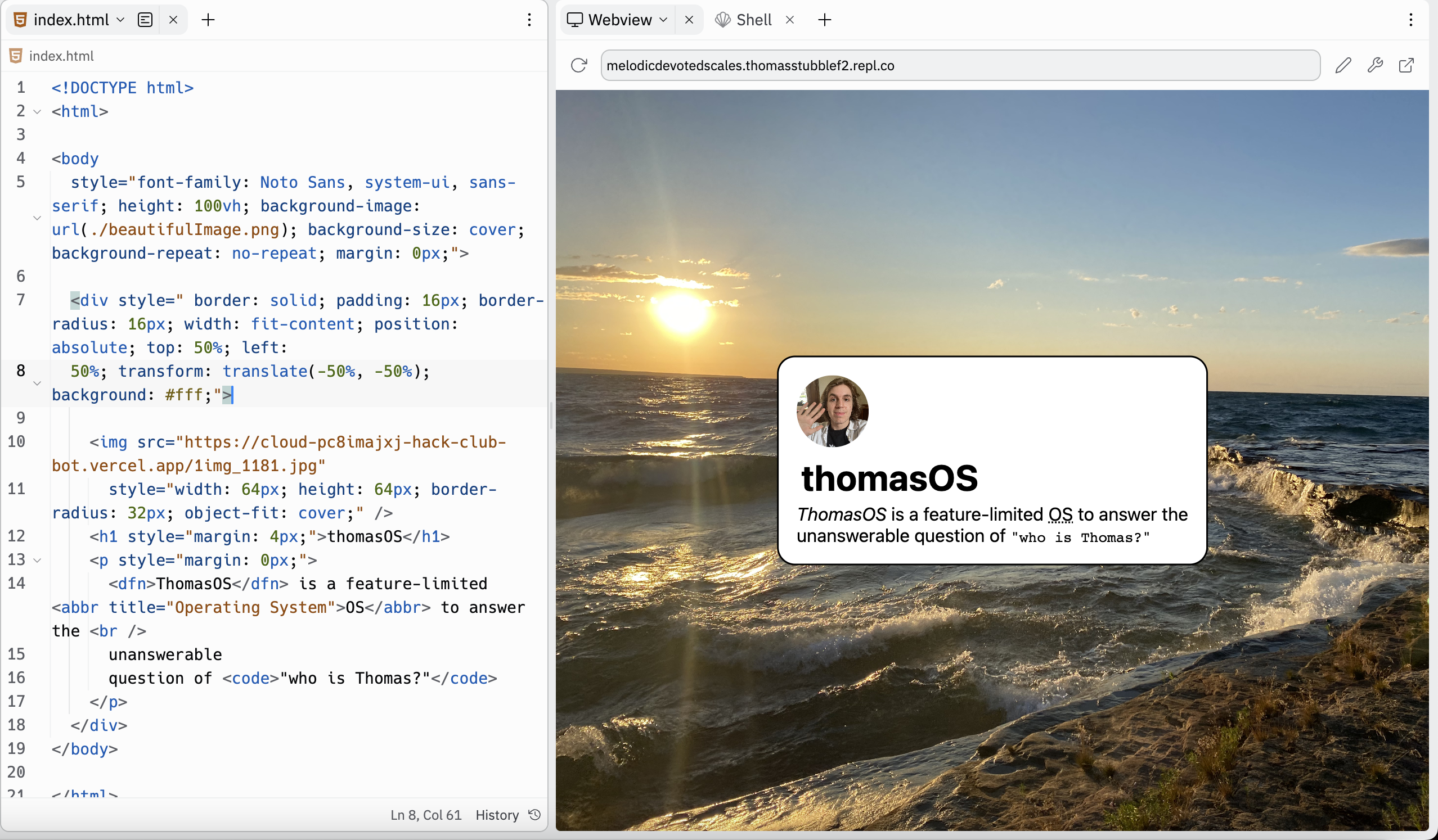
Adding the background is surprisingly easy!
- Find your image (I'll be using a photo I took in Michigan)
- Drag it into Replit (the file manager)
- On your body tag as the style property of
background-image: url(./NAME_OF_YOUR_IMAGE.png) - Adding
background-size: cover;to the body to make the size of the image fit the screen. - If your image still isn't quite fitting, add height: 100vh as a property to your body. This will make the height of the background 100% of the vertical height of your browser.
(optional bonus challenge, try using a gif instead of a png)
Separating the Window from the Desktop
Alright well this is looking beautiful!
Let's add a background color to our window so it looks visually distinct from the desktop.
Creating Our Top Bar
A top bar is generally used to display the name of the OS, key functions of a selected application, and the time. You can choose to display all or none of these pieces of information. You may also decide to give it different functions!
I'll show you how you can add the name of the OS and the time. You can do whatever you want with it though!
Creating the Foundation
Alright, let's start by just making a div (a group) to contain our top bar.
Horizontally Aligning The Elements
Now... let's add some text and make the text horizontally aligned (by using display: flex which by default places text into columns)
Note: Aye... I heard you want to master Flex. Is that right? If so, I CHALLENGE YOU (yes you) TO TAKE ON THE ULTIMATE FLEXBOX FROGGY CHALLENGE (basically tap this link and play a super fun game to learn about flex)
Customizing the Spacing
We can optionally space-out the content by applying justify-content (checkout this justify content testing site to see how you can use justify-content to space out content)
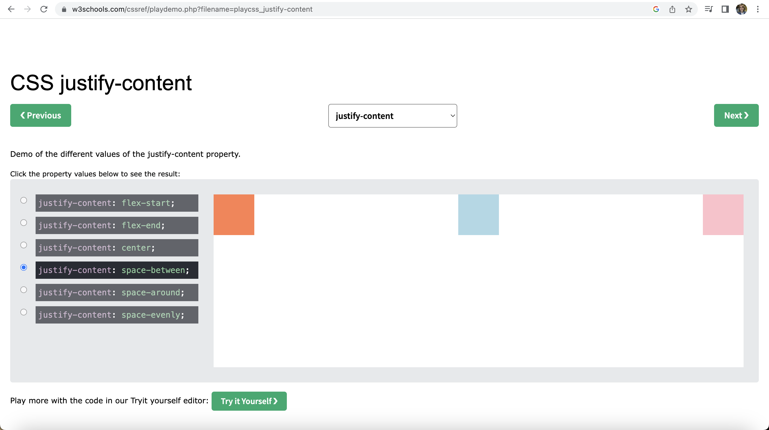 based on this demo, I decided I want to use space-between in the example below, but I encourage you to checkout the testing site and pick what justify-content style works best for your design!
Translucent Background
Now you can also add a semi-transparent background to your top bar by using RGBA. Try adding
RGBA stands for Red, Green, Blue, Alpha where Alpha is the level of transparency (0 being fully transparent and 1 being no-transparency or opaque). You can also google RGB color picker and then manually write the transparency from 0 to 1.
Here's an example.
Note: You'll also notice I threw in their a backdrop-filter to blur the background. You can do that too!
Note: Please don't just copy this. Make it your own and make it look interesting in your own visual aesthetic. This Jam is an absolute waste of your time if you're not experimenting and having fun while doing it. This isn't home work, this is your freedom, this is your art, this is your life! Enjoy it!
Personalize It
At this point, you don't need your hand held. Let's take off the training wheels and try making it look cool in your own way.
Here's how I decided to make mine look
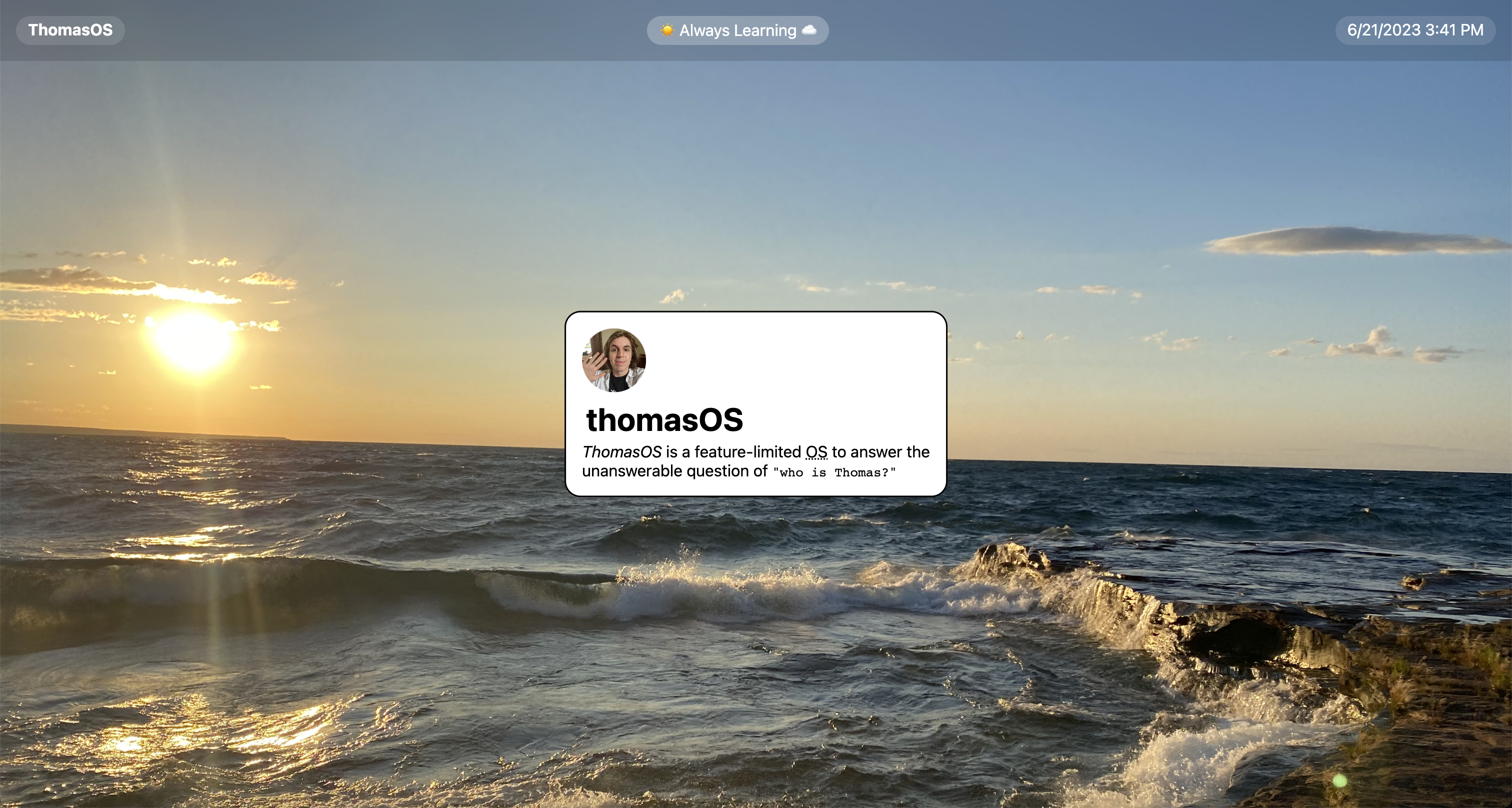
I hope yours looks totally different! Here's my code in case you want to take some inspiration from it. (but again, DON'T MAKE AN EXACT STYLE COPY)
Ideas to spice it up:
- Try different putting different content in the top bar
- Try a different color
- Try including more or less elements
- Include an image in your nav
- Make it a bottom bar! (using the absolute positioning and the bottom property instead of the top property)
Tracking The Time
I promised you java script, so of course I am going to give you JavaScript.
JavaScript brings logic to your website. It's how your OS will respond to events (whether those be user events or events like the changing of time).
We can write JavaScript it's own file, or we can just write in the HTML file inside of a <script> tag. We're going to start inside of the HTML file.
Where Do I Write JavaScript?
You can include your script tag in the html file.
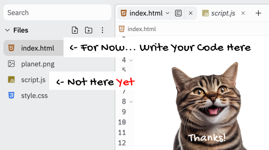
At the moment we're going to be writing our code inside of our HTML file. We're not touching the script.js file yet (until next Jam)
How Do I Get the Time?
Let's begin by getting the time and storing it in a variable.
Alright let's break this down.
The var keyword indicates that we're creating a variable.
currentTime is the name of the variable that we're creating. We could've given this variable any name (I encourage you to try naming it something else, just for fun).
new Date().toLocaleString(); is a browser function that gets the current date and formats it into plain text (what we hackers call a String).
Note: You don't need to know new Date().toLocaleString, you only need to know how to google "How do I get the current date as a String in JavaScript"
How Do I Display the Time?
We have a value in JavaScript and we want to put it inside of our HTML text.
Here's how we go about doing that.
Mark the text we'd like to alter
Let's add an "id" to the time text so we can select it. Here's how that might look:
Select it in JavaScript
We can use a querySelector to select the element and store it in a variable. We pass into the querySelector the id of the element we're working with:
Note: We placed a # in front of the id name to indicate it is an id
Alter The Selected Element In JavaScript
Finally we can set the innerHTML (the peanut butter in the bagel sandwich) and change the value (perhaps to cream cheese).
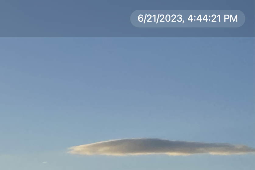
boom, now we get the current time, but don't be too quick to celebrate. You'll notice the time doesn't update. This is because the code inside the script tag only runs a single time (when the page is first opened).
We need it to run every second.
Make it run every second
We can use the setInterval function to make the code repeat every 1000 milliseconds (every second).
Here's how we can go about doing that
I placed our previous code into a function (think of a function as an operation that we're telling the machine to run) and put that function inside of a setInterval (think of this as a robot that does the function every set amount of time).
These five lines of code are very readable, but what if I told you there was a way to do it in just 3 lines line.
Try doing updating the time every second in just three lines and then check the solution below
Lovely, here's what we've ended up with:

For your final bonus challenge, try adding something interesting to your background. Maybe make it a gif?
Remember, this is your site.
Farewell my dearest Hacker. I suspect we shall meet again... in the next Jam.
What will be there? That's for me to know and for you to find out 👀