Presentation
Video
Build Your Welcome Screen
 SerenityUX
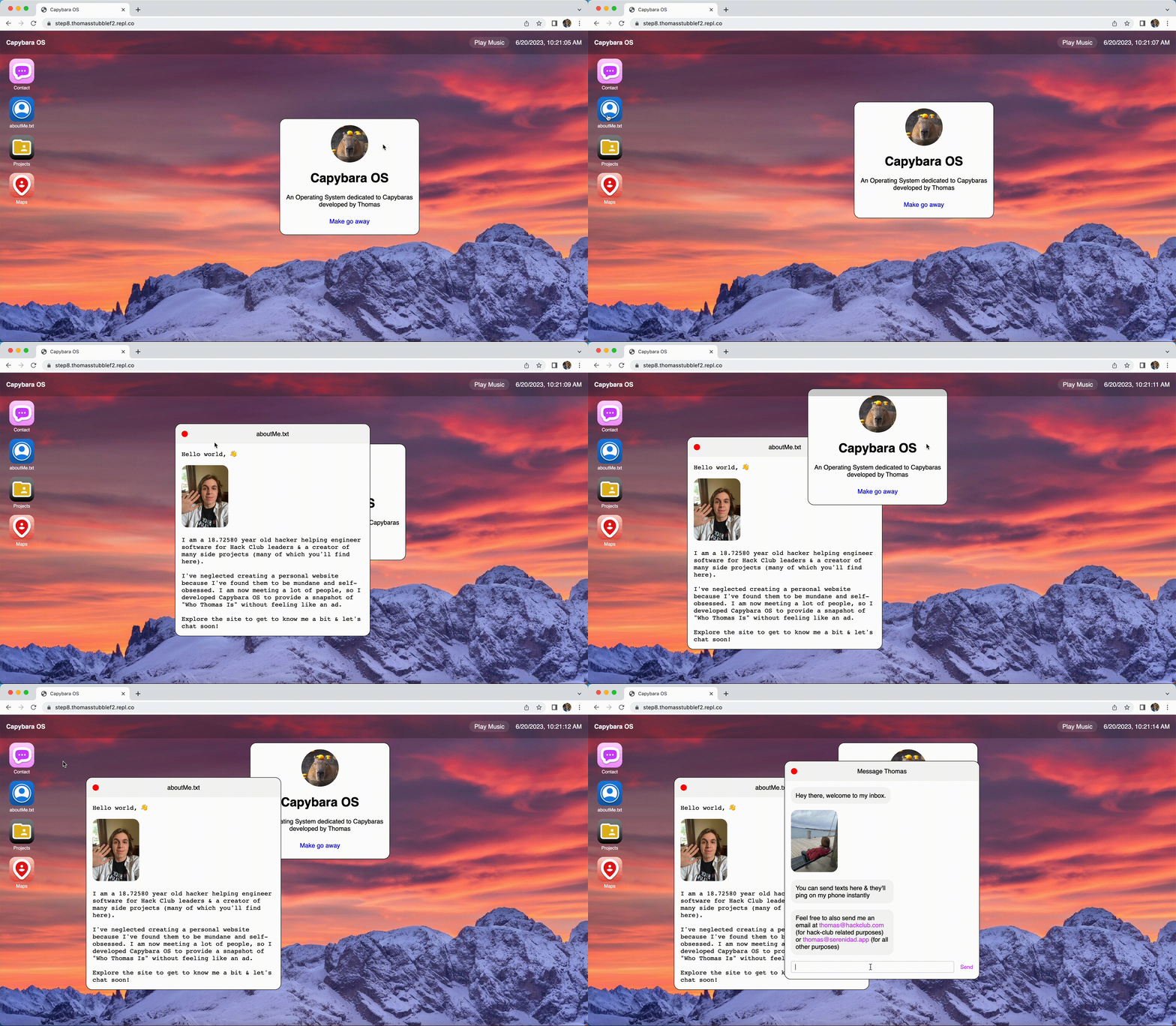
(p.s. this is a sample of what your OS might look like at the end of the entire batch, except HA NO it's going to be about you and fit your vibe so not look/feel like this at all. Yours will also have a totally different set of apps by the end of the batch.)
The Operating System (OS) will be entirely web-based (using HTML, CSS, and JS). An Operating System is the interface & set of logic you use to interact with applications. You'll be the designer and developer of your OS (so you'll have complete creative freedom). You'll decide the content, style, features, etc. If your website looks totally different from mine by the end of the batch jam, then you've done the Jam well. If it looks the same, go back to the drawing board. Your Personal Operating System will be a website you can share with people (friends, club members, people you meet at hackathons, etc) to allow them to easily get a sense of who you are and the type of things you like to do.
Today you'll be creating an awesome welcome screen for your personalOS. It will be plenty of fun and you'll have an awesome-looking one-of-a-kind product that you'll build upon in subsequent Jams.
There are six steps/headings in this Jam! Go through each and begin building your personalOS.
Outline:
- Enter The Code Editor (start coding in your browser)
- Build with Elements (create elements for your welcome screen)
- Personalize Your Content (make the content personally relevant to you)
- Style Your Elements (make your elements fit your aesthetic)
- Next Time on Building Your Personal OS
Enter the Code Editor
Hey there Hacker! Let's get you setup
Create an Account
Head over to the Replit Website and create an account
2. Create a new Repl/Project
Welcome to your Replit Dashboard! Once inside, tap create a Repl and then select HTML, CSS, and Javascript as your template.
Replit will kindly start you off with some boilerplate code (starter code).
Build with Elements
What are elements?
Every site you've ever visited has elements. Elements are the building blocks that come together to create websites. For example, this block of text is an element. The gif you'll see below is also an element. Even the container that holds the text you are reading is an element. Try right clicking this site and tapping Inspect, you'll see a bunch of elements. HTML is the file format for these elements.
What makes an element?
Elements consist of three parts.
Elements consist of an opening tag, the content in the middle, and a closing tag. So for example <p>Sample Content</p> creates paragraph text because there is an opening tag (<p>), with content in the middle (Sample Content), and a closing tag (</p>) indicating where the content ends
 (bagels are a lot like tags or I suppose you could say tags are a lot like bagels... depending on your perspective)
Where can I place them?
Let's begin by deleting all the starter code that replit gave you.
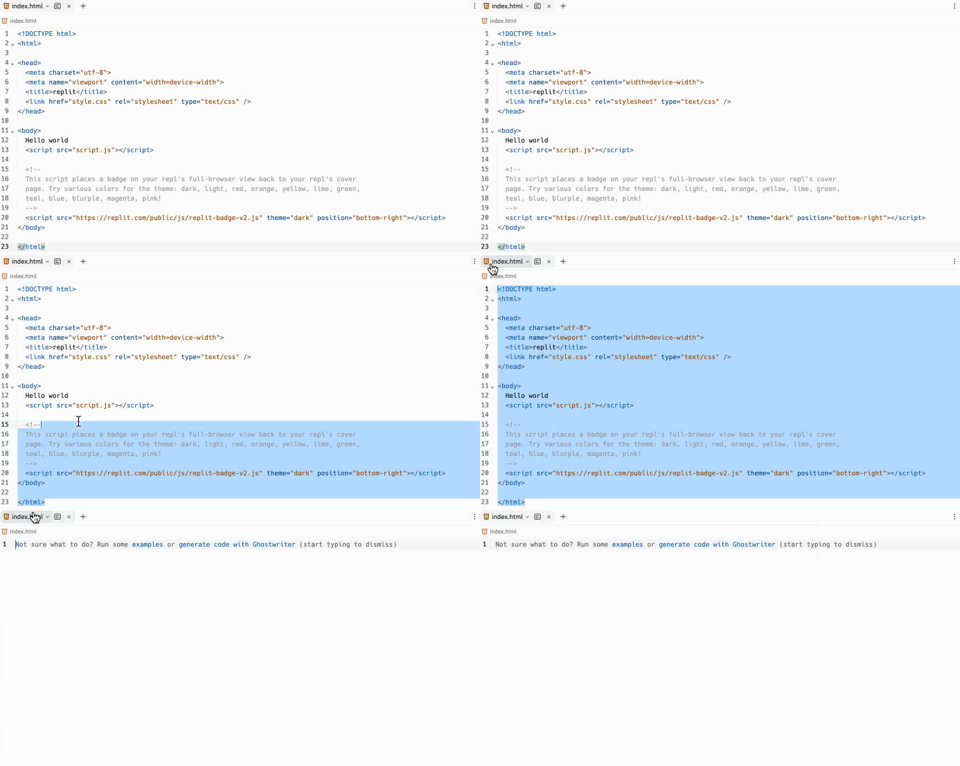
Orpheus the Dinosaur (don't ask who Orpheus is) asks that you please copy and paste the code below into your project
The body of your site is contained inside of an opening tag (<body>) and a closing tag (</body>). The content of your site goes inside the body. Inside your body is where you'll place your elements.
It's sort of like how cream cheese goes inside of a bagel. A bagel has a top and bottom and all of the tasty cream cheese in the middle.
Let's fill your body tag sandwich with some tasty content! 🥯
How can I make elements for my welcome screen?
Inside of your body tags, let's write some code
You've created your first element & it's a <p> element (p stands for paragraph)! Congratulations!
Let's try making a heading! Simply create a new element with h1 tags.
Awesome. We can also make smaller headings. h1 is the largest heading, but you can also create an h2, h3, h4, & so on.
Text is neat, but let's add an image: First we need to drag an image into Replit file manager.

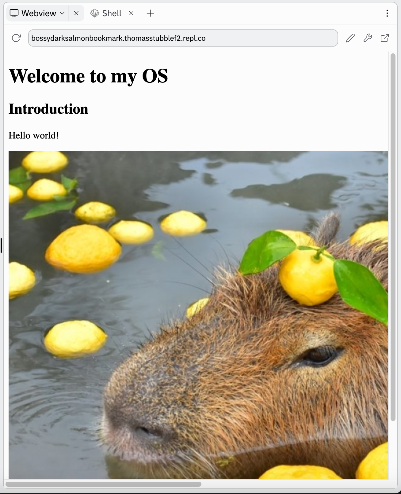
You can also do a direct link to the image (has .png, .jpeg, etc at the end of the url), so for example here's code for placing an image of a Capybara
<img src="./imageOfMe.png" />
The image tag has a property of src which stands for source. You can pass in the direct link to the image or import an image and set the src as "./imageName.png".
Let's link to another page
HTML (HyperText Markup Language) was built for scientists to be able to share research documents (& is now used on every website on the internet). If you know anything about scientists, then you know they LOVE to reference other pages.
For this reason, HTML makes it easy for you to hyper-link to other pages.
Replace label with the label of the button (so for example Instagram) and link with the url (like https://www.instagram.com/starthackclub/).
You can use this to link to a personal social media, a GitHub, a random website about your favorite creature, or just not make an a tag at the moment. It's totally up to you.
Personalize Your Content
Soo... surprise, you didn't realize but you just started your onboarding screen for you operating system.
Go ahead and fill it up with your own content.
Don't know what to add? Perhaps try:
- Linking to your favorite playlist
- Adding a picture of a pet
- Writing a bit about your favorite hobbies
- etc
Customize the text content and image
Make the text content whatever you would like users to see when they first land on your site. Be creative and have fun with it!
Select an image for your site that represents you (either literally like a selfie or metaphorically like your favorite creature) by changing the src of the image to a URL or path to your image.
Additional Challenge
Discover some unique tags on the W3 Tags Site. There are 100+ tags for you to experiment with. Go dive into the W3 Tags Directory and find some random tags and experiment with them on your site. Have fun :)
here are some tags we really like:
<s>Strike Through</s><p>break the </br> line like this</p><p>use strong to <strong>bold text</strong></p><p> <dfn>DFN Tag</dfn> is a tag that marks something being defined</p><p><abbr title="abbreviation">abbr</abbr> is a tag that marks an abbreviated term</p>
Content Complete
Okay, so you should now have the content for your "Welcome to My OS" screen and it should feel totally unique to you (i.e. if a friend saw your welcome screen, they would immediately know it was your OS).
Your content most likely looks rather bland and uninteresting which leads us into our next topic... styling our content!
Style Your Elements
What's a style?
A style is a property-value pair that changes the way an element looks.
Styles can exist within an html file when written in-line, but can also be in a separate file (styles.css). For now, we're going to write the styles inside of our HTML file (inside of opening tags)
To apply a style, it's as simple as:
<tag style="property: value"> content </tag>
Every style has a property and a value. For example a style may be color with the value of red (to turn the text red)
Styling Color 🎨
To change the color text you would simply write
<p style="color: red">This text is red</p>
You can also add a background color:
Easy, right?
*p.s. you'll notice I used hex (#c9ffcf) instead of the name of a color (red) for the second example. Hex is a format for representing color. You can use either the name of a color or the hex value. To find hex values, try googling "hex color picker"
Styling Shape & Size
Images can have styles too!
Your image is probably very large. Let's change the size & shape.
IF YOUR IMAGE IS TOO LARGE OR TOO SMALL, BE SURE TO ADJUST THE HEIGHT AND WIDTH AS IS DONE BELOW
Simply go to the image and apply a style property that sets the width and height:
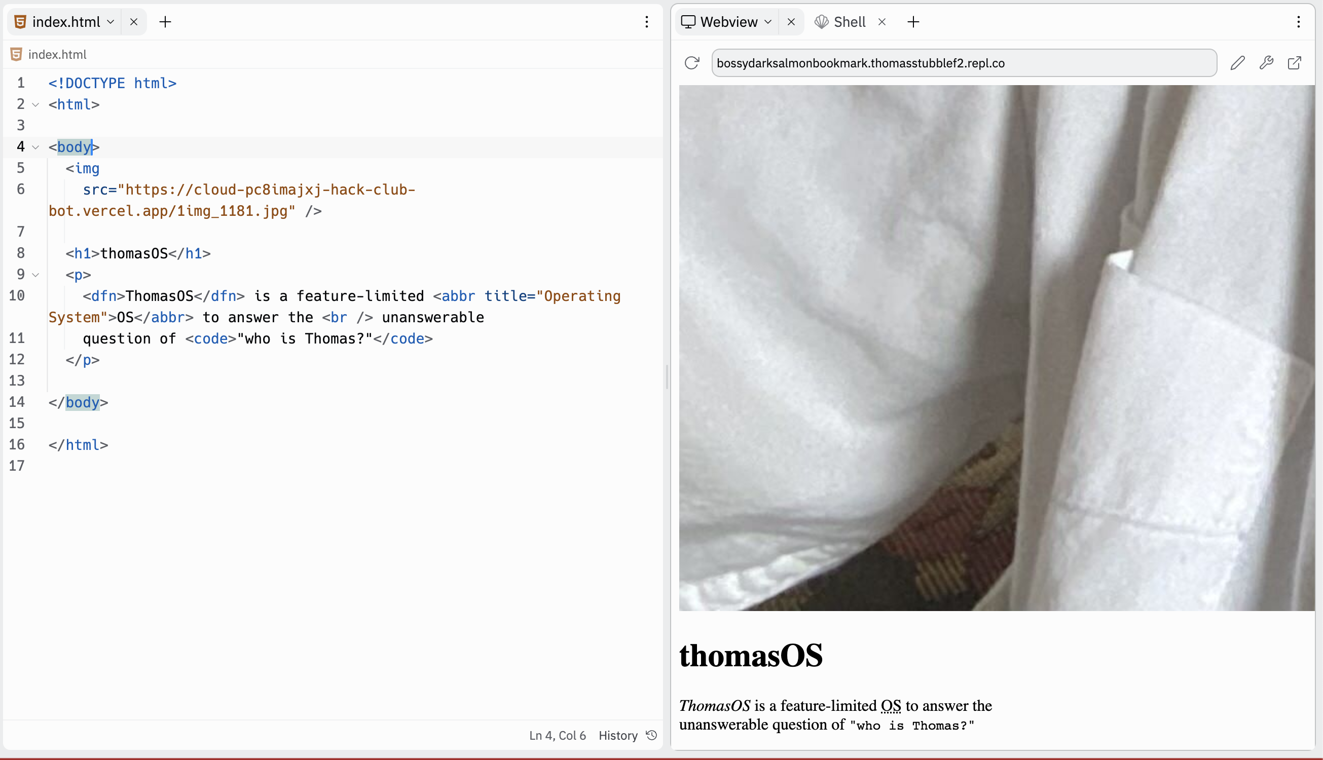
<img style="width: 64px; height: 64px" src="https://cloud-pc8imajxj-hack-club-bot.vercel.app/1img_1181.jpg" />
I chose to make the width and height 64px, but you don't have to! Pick your own size, play with it, and have fun!
Note: Semicolons are used to separate css properties
*Crunch*
Your image might be a bit crunched up. Try to Google how to fix this (maybe even ask GPT). Even a very basic search term such as What is the CSS Property for making an image not crunch, would probably work.

*Rounddddd*
Optionally, you can round your corners. Try googling this! (maybe you can even turn your image into a circle shape if you'd like)

Styling Font
Adding a font in CSS is easy!
The easiest way to add a font is to visit the W3 Library of browser-built-in fonts and select one that fits the vibe of your site!
Once you pick out your favorite font(s), go to the body and put a style property of font-family on the opening tag.
<body style="font-family: Helvetica, Noto Sans, sans-serif">
Note: If you want cooler fonts, checkout Google Fonts and this document for learning how to integrate a google font into your project. You'll need to put a link inside head tags (which includes content that is not visible on the site, but that the browser uses to configure the site)
Additional Note: not all computers have access to the same fonts, so if a computer does not have access to a font, it will go to the next one in the list. For this reason, I suggest putting selecting your favorite three fonts and putting them in order from most-liked to least-liked.
Final Note: you can use the font-size property and font-weight property to further change the visual appearance of a text element
Styling Space ✨
Space is created by a combination of Margin (not margarine, MARGIN) and padding (fluff).
Margin is your space between your picture frames on your wall.
Padding is the gap between the photo and the frame. If you had a box with an item in the middle, the space between the object in the center and the walls of the box is padding.
Also... here's a comedy skit by Shubham at Epoch Bay Area to learn about Margin and Padding
We'll get more into this later, but right now I would just like to bring our items closer together.
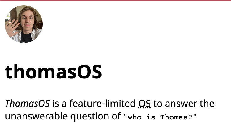
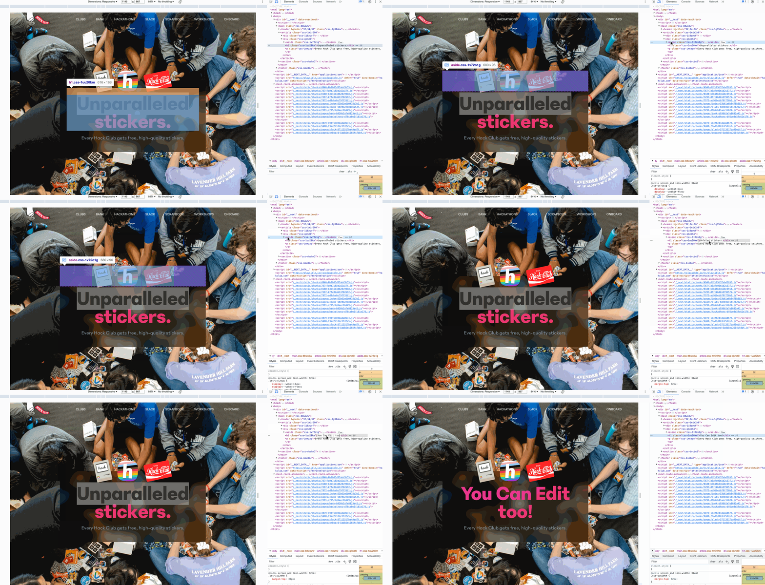
So if we open the inspect window...
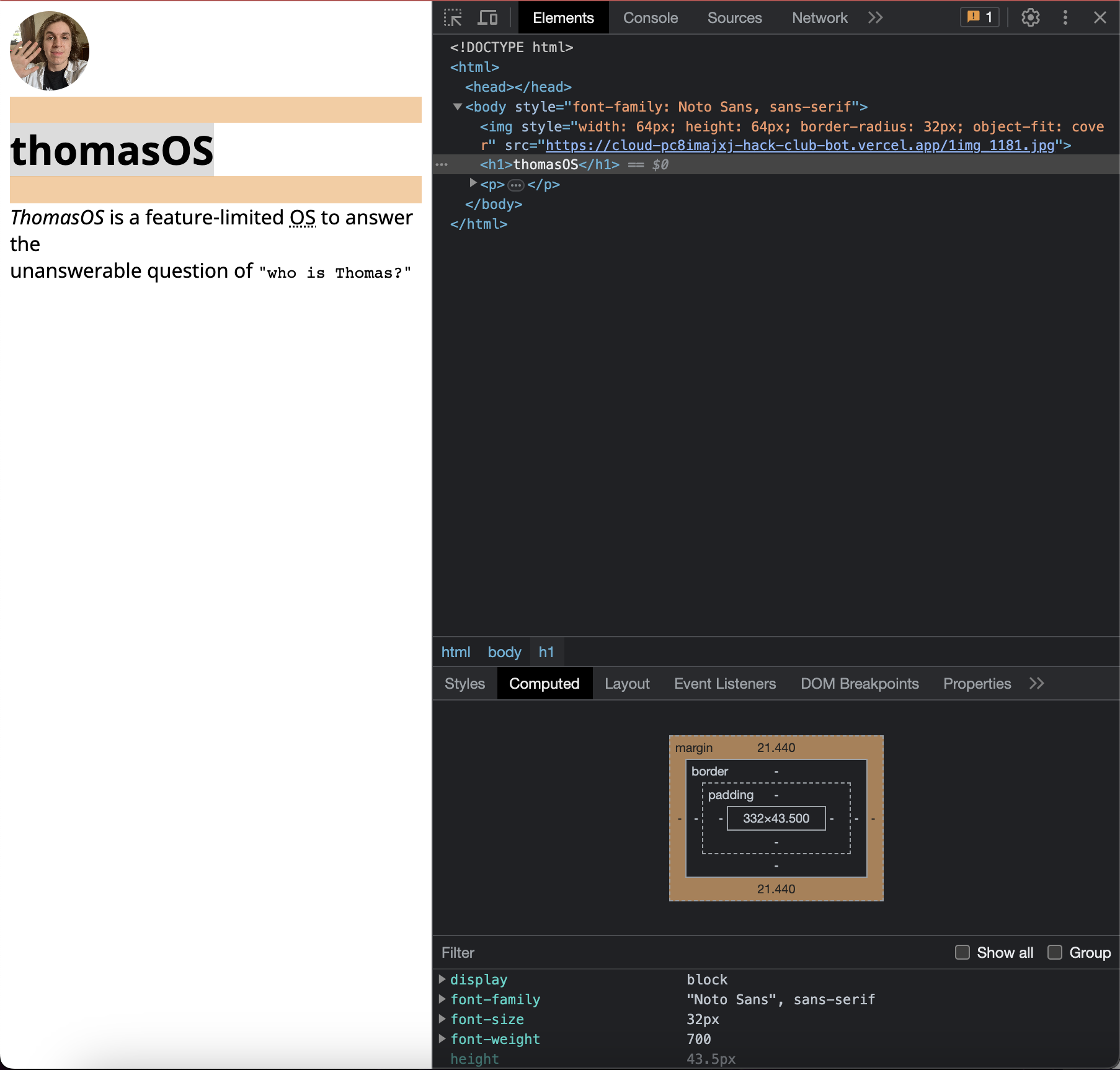
We can see that the default margin on the h1 is quite large and it's making the site look a bit awkward. Let's correct that.
Let's reduce the margin on the h1 tag
<h1 style="margin: 4px;">thomasOS</h1>
Note: px stands for pixels, so we now have a 4px space on all sides for the header text element
If you wanted to add some space within your heading, you could add padding, so perhaps make it
<h1 style="padding: 4px; margin: 4px; background-color: #000; color: #fff">thomasOS</h1>
(you can see the padding added a gap between the walls of the element and the content itself)
Keep Hacking!
Try adding the background-color, color, and font-family properties on your body tag to make your site look funky (or whatever style you're going for). Not sure how to use those styles? Google it!
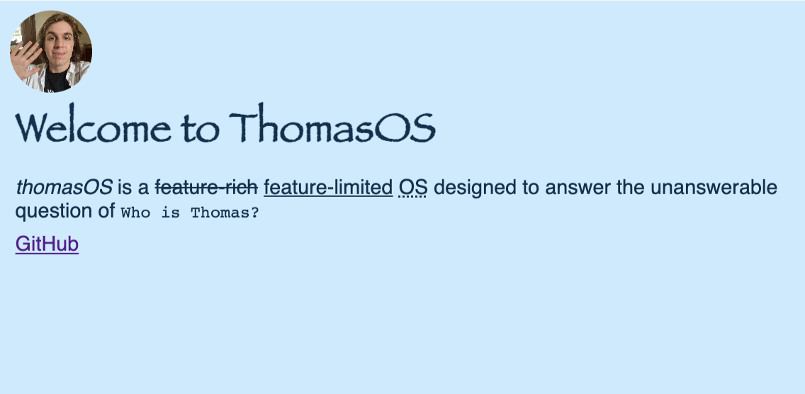
This is what mine looked like after some tinkering. Go for whatever makes you smile! This was just my style in the moment of writing the Jam.

Note: with both padding and margin, you can change the spacing in a specific direction by appending -top, -bottom, -right, or -left. For example you could add margin-top: 4px; or padding-left: 16px;
Alright, lovely! Here's my finished site for this episode of the batch. I hope your site looks nothing like this! Please take the opportunity to have fun with this site and do something wild!

Note: You'll notice I added some unique looking tags inside the paragraph text, YOU CAN DO THAT TOO BY CHECKING OUT THE SOMEWHAT OPTIONAL ADDITIONAL CHALLENGE BELOW.
Next time on building your own PersonalOS...
In the next episode we will build the foundation of our OS by:
- Adding a wallpaper
- Creating Your Window
- Creating the top bar
- Tracking time with JS
